Capturing winter light with oil paints
As an artist, one of the things I love most about the changing seasons is how it can show you new sides of a landscape.
Coming from the autumnal golden light into the winter months, we often witness more dramatic changes in light. This can make for some beautiful paintings – if you know how to capture it.
In this blog post, I’m going to share some tips on how to paint winter landscapes using oil paints. We’ll cover everything from choosing the right colours to understanding the different types of light you’ll encounter.
The importance of contrast in winter painting and how to use it to your advantage
To begin, let’s consider the contrast in your painting. Contrast is the difference in light intensity between the lightest and darkest areas of a painting. High contrast means there is a big difference between the light and dark areas, while low contrast is the opposite.
I like to use a Japanese system called ‘Notan’ for this. The word notan means “dark-light” in Japanese. It’s the process of converting patterns of light and dark into simple shapes. Taking a few moments to notice the contrast and light source can be a gamechanger as you can then develop your painting with a little more attitude and confidence.
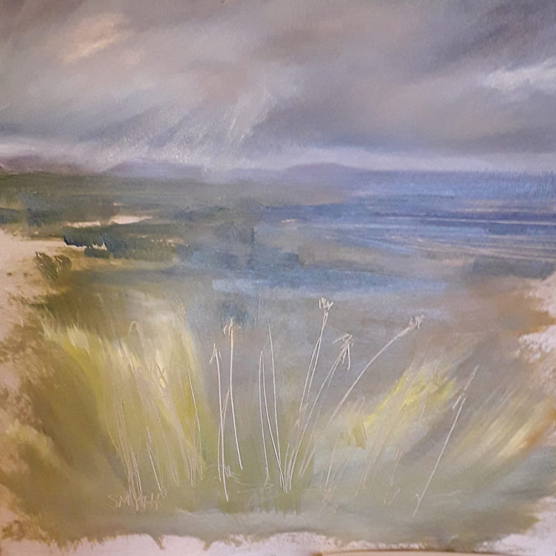
With the lower winter sun, you sometimes get fabulous side illumination, casting brilliant warm yellows into areas of shadow. Having the source of light lower in the sky brings out textures in otherwise bleached surfaces. Our eyes are hungry for warmth in the winter, so use of warmer colours, in a muted tone, can be very effective in leading the eye through the painting, but only in small, considered amounts, otherwise the effect can be lost.
The challenge of colour in your winter landscape
One of the challenges of painting winter landscapes is conveying the colder, more sombre palette. But luckily, there are a few ways to do this.
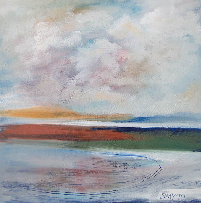
You can watch how the clouds moving over the ocean can drastically change the colours within the ‘blue’ sea. Having such a big expanse makes you appreciate how the different colours in the sky reflect and influence the sea surface below.
Capturing winter light in a seascape is particularly interesting as the reflections and refractions of light through the clouds, and how it bounces around on bodies of water, can often seem confusing. But, when we incorporate the laws of physics, we realise that a low winter sun can send light from background clouds into foreground reflections.
It’s the acceptance of this and allowing this into your painting as you perceive it, rather than how you ‘think’ it should be, that’s the key.
Consider using a limited colour palette. This will help create a cohesive painting and prevent your colours from becoming muddy. Make sure your blacks and whites are clean and pure. This will give your painting more depth and dimension. Finally, don’t be afraid to experiment with different shades of blue and green. These colours can really help capture that winter feeling.
Understanding the different types of light
Another challenge of painting winter landscapes is understanding the different types of light you’ll encounter.
There are three main types of light that you’ll encounter when painting: direct light, indirect light, and diffused light. Let’s take a look at each one in turn.
Direct light is when the light source is directly overhead, such as when you’re painting outdoors on a sunny day. The shadows will be sharp and the colours will be very bright. This type of light can be tricky to paint because it’s easy to oversaturate the colours.
Indirect light is when the light source is not directly overhead, such as when you’re painting indoors near a window. The shadows will be softer and the colours will be more muted. This type of light is more forgiving than direct light, so it’s a good option if you’re just starting out.
Diffused light is when the light is scattered, such as when you’re painting under a tree on a cloudy day. The shadows will be very soft and the colours will be very subdued. This type of light can be tricky to get right, but it’s worth taking the time to master it because it can add a lot of depth to your paintings.
By paying attention to how the light hits different surfaces, you’ll be able to create more dynamic and interesting paintings.
For example, if you’re painting snow (when we get it), you’ll notice how the light reflects off the surface. Similarly, if you’re painting a tree against a cloudy sky, pay attention to how the light filters through the clouds and casts shadows on the tree. By understanding these different types of light, you’ll be able to create a more dynamic and interesting painting.
The process of painting winter light
This is a quick rundown of how I approach winter landscape painting. Feel free to tweak my methods to suit your style.
Begin with giving your canvas a wash of colour with solvent, paint and a cloth. The uneven distribution of a wash allows for subtle spontaneity in your work.
I often refer to a colour wheel when doing this. Creating colour samples of your greens and blues before you begin will give you confidence when moving from palette to canvas, but also give you information on complementary colour use before you begin.
I often use a complementary colour as a wash on the canvas. For me, it gives a glow behind the sky and can tie the painting together in a more organic way.
As always with oils, the lighter, thicker colours are painted over the thinner, darker layers, so start with your shadows. During the winter months, notice how these shadows can be longer, cooler in tone and exist more dramatically alongside lighter areas. There can be much more contrast in comparison to softer, perhaps more graded or blended, shadows of the summer months.
Squinting at your scene will release tension of having to get everything exactly ‘right’ and provide a better light and colour comparison for impressionistic style.
Don’t skimp on your shadow areas. Be confident in knowing that at least you’ll have lots of shadow areas to work with. Most of your darkest shadows will be in the first third (foreground) of your painting. Your lighter, thicker layers will cover some of the shadow and, when you are working ‘wet on wet’, there can be lovely and natural mixing of these paint layers which can lead to marks which you may wish to leave.
‘Blocking in’ areas with specific colour is fine and may be a choice relating to your personal style. However, I like to allow small areas of the thinner paint layers and colour to come through while I’m painting. For me, it creates greater interest and life. As if the painting is breathing.
On a practical level, an optical shift occurs in winter which draws the horizon closer to the eye, typically towards the end of the foreground of your painting. There is a more intense strength to shadow in foreground which the eye reads as being more ‘wintery’.
The mid-ground becomes more ‘washed out of colour’, this is where the actual horizon often exists. Then the top third of your painting is usually quite misty or ‘greyed back’.
Colour choices to have a play with include Paynes grey, Naples yellow and Prussian blue (a personal favourite of mine as it’s so versatile).
Conclusion
I hope these tips have been helpful in thinking about how to paint winter landscapes using oil paints. Remember to pay attention to the colours, contrast and the light when creating your paintings. And don’t be afraid to experiment – that’s half the fun!